I’ll admit it — I was turned off by the new Arc browser from the beginning.
For one, there’s the maker’s name: The Browser Company of New York. Are we meant to imagine the browser being crafted in a converted blacksmith’s forge in Brooklyn, offering farm-to-table HTML? And it was designed for the Mac. Then there was my attempt to try out the beta several weeks ago — the browser hung while I tried to make an account, and wouldn’t let me through. A support request went unacknowledged.
That’s not really fair, though. So when *sigh* The Browser Company of New York announced that its free Arc browser was finally ready for Windows users to try alongside Google Chrome, Microsoft Edge, and others, I gave it a try. And you know what? It’s actually okay.
The problem I face, however, is that the Arc browser wants you to learn its ways. I don’t mind quirks, but I’ve never liked a “you just don’t get it” attitude. And there’s definitely a bit of that throughout Arc.
Full disclosure: I’ve never spoken to The Browser Co., and I was never offered a walkthrough or a press briefing. That’s fine, as it puts me in the shoes of an average user. From the get-go, the experience is familiar: You’re asked to download a small installer, which downloads a more complete package.
Unfortunately, Arc is one of the new breed of browsers that requires a username and password, full stop. There’s no anonymous option, at least where Arc is concerned. To use it you’ll need to provide an email address, plus a username and password. For mobile, Arc is limited to iOS support — not even a true mobile browser, but rather an odd sort of sidebar. Android users are out of luck, for now.
Mark Hachman / IDG
As you might expect, you’re offered the option to import bookmarks and passwords from another browser; I was only able to select one browser at a time, however. (I have a dedicated version for work, and one tied to my personal account, and I had to select one.) You can import from other browsers later, via the Settings menu.
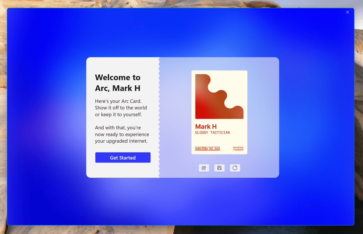
And then there’s this thing: a weird badge. Is this some sort of speakeasy gimmick?

Mark Hachman / IDG
Once you’ve opened Arc, though, you’re faced with something unusual: a blank page. Whiteness. I’m used to browsers pushing content or suggested web pages at me when I open a new tab, so this white void was…peaceful? Zen? Evidence that TBCoNY hasn’t quite polished Arc to completion? Possibly.
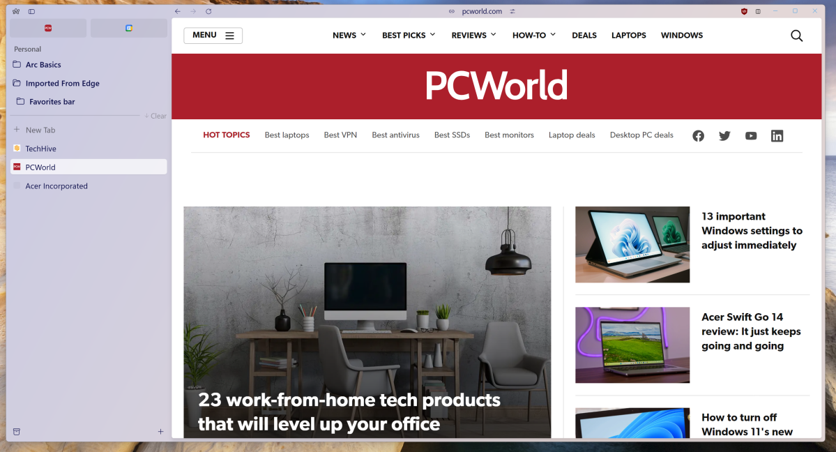
The other major change that Arc offers is the elimination of the search bar, or “omnibar,” at the top of the page. If you’re on a web page like pcworld.com, you’ll see “pcworld.com” at the top of the page — and that’s all. The UI is extremely minimal: forward and back buttons, a way to copy the link (?), a “control center” describing the site’s basic attributes, and a “split screen” icon at the upper right that opens two side-by-side windows. That’s it.

Mark Hachman / IDG
My instinctive reaction was to mouse toward the address bar, much like you might grab for a handrail if you’ve stumbled down the stairs. But there isn’t one –and there’s no row of tabs, either. Arc places the tabs in a vertical column to the left, usually an option on other browsers. It’s just a little jarring when Arc makes this choice the default.
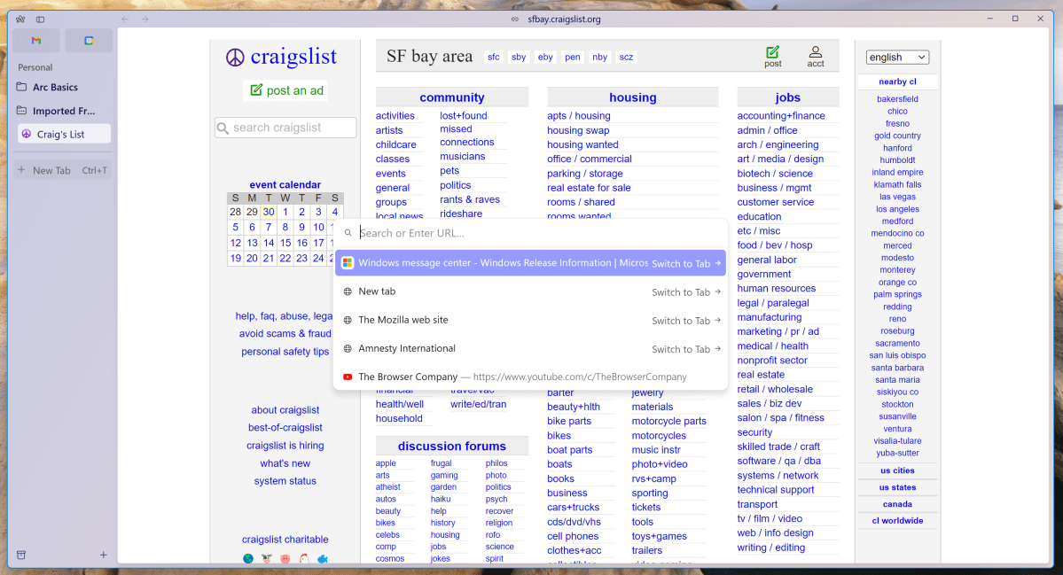
If you do want to open another website, you’ll need to click on the site address at the top of the screen. That opens what Arc calls the “Command Bar,” which is a floating URL window with a list of recent sites. It works just like the search/URL bar you’re used to — but there’s nothing really pointing you to it, either. Even the menu option to get there is obtuse: You have to open the Settings menu by clicking the tiny “A” in the upper left-hand corner, then navigate through Tabs > Open Command Bar to find it.
And bookmarks? For one thing, Arc collects everything into what it calls “Spaces,” a collection of bookmarks and tabs that you can organize into their own groups. Again, I’ve seen this in other browsers.
But everything is in the same column: your bookmarks and the open tabs. Microsoft Edge, Google Chrome, and other browsers generally provide a row or three: one for your bookmarks, one for the current tabs, and one for the URL bar itself. Arc simply provides a seemingly endless column of information. Arc may think that its way is…better, but I’m not a fan of letting aesthetics get in the way of functionality.

Mark Hachman / IDG
But how does Arc perform? Rather well. The browser opened a PDF and imported and inserted my passwords into a few random sites I tried. (It doesn’t yet support passkeys, however.) And when you prompt it to open a web page, boom! It just does.
Arc’s a little different than most browsers, as it uses a version of Swift, rather than Chromium, to render a page. But it’s hard to call Swift, or Arc, a superior browser without running benchmarks — which I haven’t done. The one thing that I suspect makes an enormous difference is that Arc seems to natively integrate uBlock Origin — an excellent ad blocker that, when enabled, gives you a web page’s content and very little else. Arc therefore renders pages in just a split second — but so does Edge or Chrome if you add uBlock Origin to it, too.
Is it efficient? According to Task Manager, an even 100 tabs (sorry) open in Microsoft Edge consumed 2.3GB. Twenty-two tabs in Vivaldi consumed 474MB, and 13 tabs in Arc consumed 391MB. But wait — I only had three tabs open in Arc! I’m not sure what Arc (or Windows) was trying to do here.
Arc also lacks sophisticated AI features that other browsers have begun to implement, such as ChatGPT integration in browsers like Brave, or the new image-generation feature Opera added this week. Whether TBCoNY considers AI essential or just another bit of cruft to prune remains to be seen.

Mark Hachman / IDG
I’ll keep an eye on Arc, of course. But I don’t expect to use it much. Other browser makers are simply further ahead, and I’m just not that inclined to chase after a UI that forces me to make adjustments to my browsing behavior. With that said, there’s always room for competition and some good ideas. If Arc does eventually launch a killer feature, I’d expect its competitors to adopt or improve upon it. We can all root for such improvements.


