Every September, a not-insignificant chunk of iPhone coverage expresses how the newest iPhone is basically a replica of its predecessor—and that’s true to some extent. Smartphones have matured for the most part, and there’s only so much a phone maker can do. This results in a mix of incremental upgrades and unnecessary additions made for the sake of change. However, while small tweaks are generally perceived as boring, they can actually be quite impactful—and the iPhone 16 Pro Max reflects that. Having upgraded from an iPhone 15 Pro Max, I don’t regret buying 2024’s flagship one bit. Here’s why.
The camera’s got serious Style
The Camera Control button is the iPhone 16’s most significant hardware introduction. While in theory, it’s a handy addition that should simplify adjusting camera settings and shooting, I’m yet to get over its unintuitiveness and manage to integrate it into my photo sessions. To me, the most remarkable camera upgrade this year has been a new software feature: the next-gen Photographic Styles.
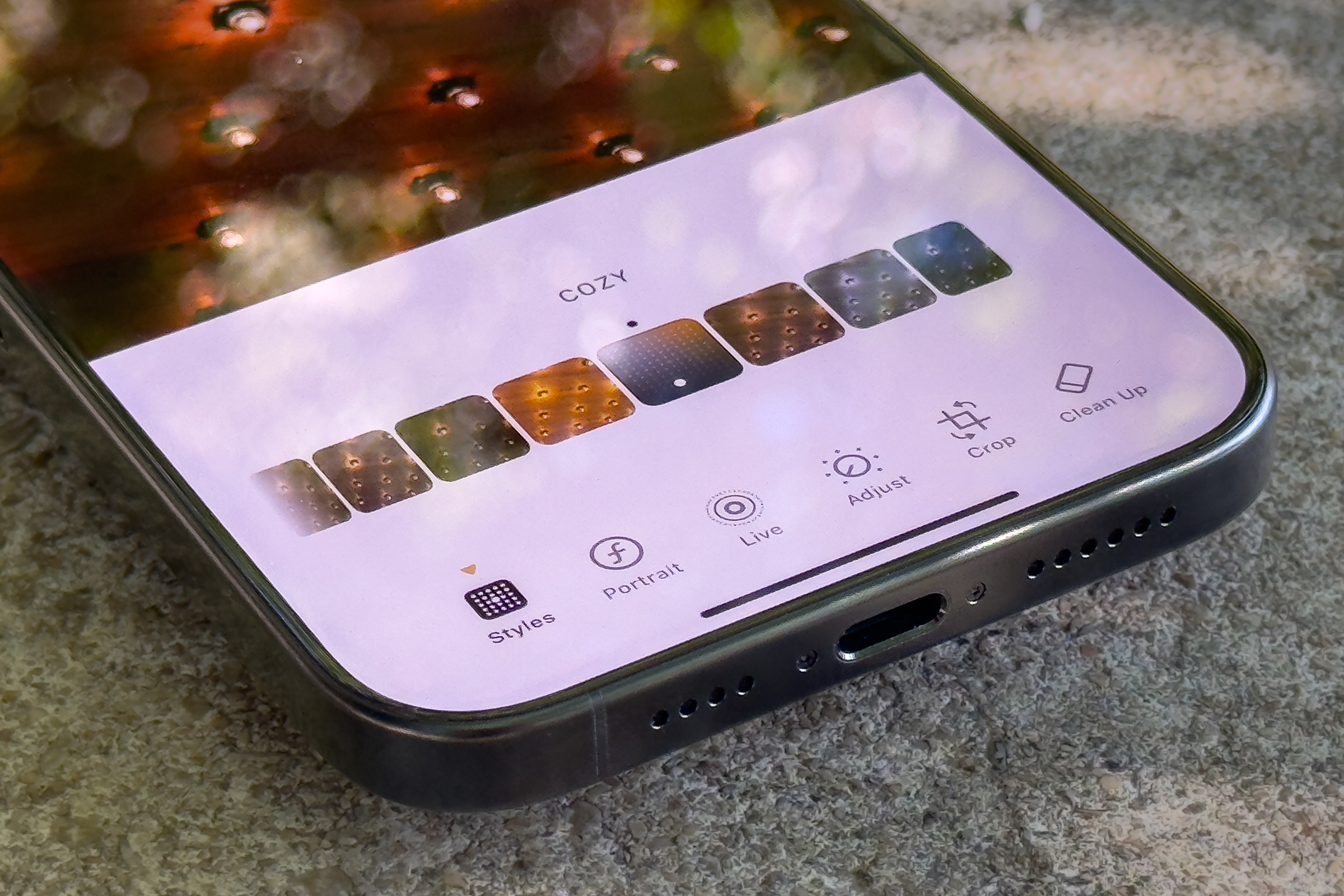
As a Lightroom enthusiast, Photographic Styles 2.0 is exactly the kind of color magic I need for casually editing everyday shots without spending a lot of time or effort. There are a total of 15 options (including the default), with each applying a distinct vibe that alters the photo’s tones, warmth, hues, and more.
Photographic Styles 2.0 is one of the best iPhone camera features in years.
Foundry
The great thing about Apple’s new Photographic Styles is that they are non-destructive. Unlike the first-gen implementation of the feature, you can shift between different “filters” after shooting, and the effects are all reversible. You can also make relevant edits on the larger display of a Mac or iPad if you find your iPhone too small.
Unlike the Photos app’s legacy filters, there are several adjustments you can make to each Photographic Style—beyond increasing or decreasing its amount. This lets you control the tone, color, and palette for each photo based on its individual shades, atmosphere, subject, etc. Despite the concept being relatively basic, the effects truly help users bring out the best in their photos.
Other iPhone 16 Pro Max camera upgrades include the 48MP ultra-wide lens for improved macro shots and support for 4K video recording at 120 fps with audio mixing. Both additions are nice to have, and together with Photographic Styles 2.0, the iPhone 16 Pro Max has been a serious upgrade to my workflow.
A redesign where it matters
Over the past several years, the iPhone hasn’t changed much about the way it looks. Instead, Apple has made small changes over multiple years, and this year’s Pro Max update continues in that vein with a slightly larger screen and rounder corners. However, Apple has made a big upgrade inside this year’s phones featuring a new cooling system and a larger battery.

The iPhone 16 Pro Max might look the same, but it’s all-new inside.
Foundry
Now, some may wonder why anyone would ever care about a seemingly meaningless tweak applied to a concealed section of the phone. Well, if you ever used an iPhone 15 Pro Max for a somewhat intensive task you probably noticed that the upper left corner would heat up and, in extreme cases, make it uncomfortable to use. Thanks to an all-new vapor chamber, my iPhone 16 Pro Max rarely heats up. And when it does, it disperses moderate heat across the entire device, keeping its overall temperature under control. While this may not be the most exciting upgrade for casual users, it has notably improved my experience while using my iPhone 16 Pro Max.
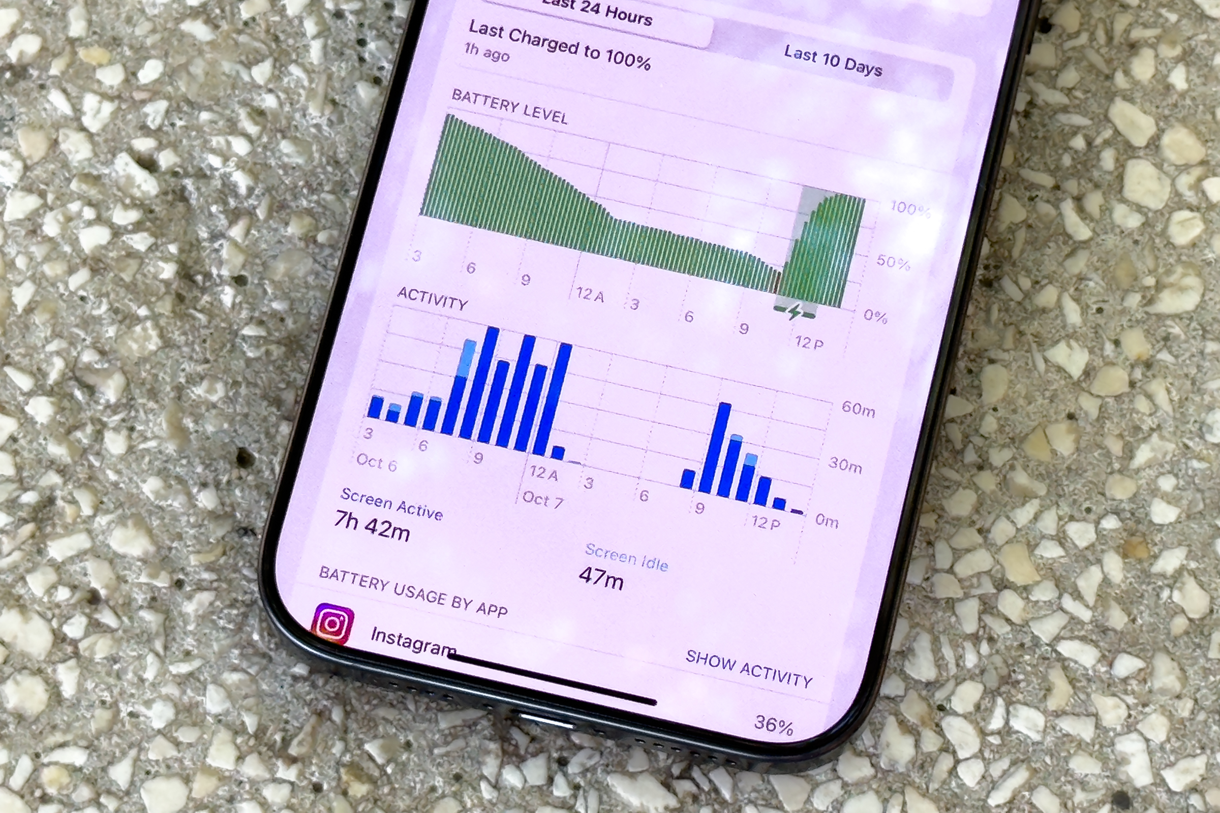
Other than the cooling, the iPhone now offers significantly longer battery life. Instead of charging my phone daily, I now do so once every day and a half. It’s particularly helpful when I’m spending a full day hiking in the wilderness, as now I can continuously rely on it for navigation, music streaming, taking photos, and texting friends without worrying about running out of juice in the middle of nowhere,
The Maxest display yet
The iPhone 16 Pro Max received two main display upgrades. Most notably, Apple has stretched it from 6.7 inches to 6.9 inches, making it the largest iPhone ever. While I appreciate the increased immersion, part of me finds it hard to concentrate on all on-screen content simultaneously.
So, when I’m looking at the top section, elements towards the bottom become out of focus. As a result, it feels like my eyeballs need to travel from one side of the screen to another—rather than spotting everything at all times. Nevertheless, the screen’s size is still manageable. I just hope Apple doesn’t stretch it any further—the 6.3-inch model is too small for my liking, and I can’t imagine dealing with an even wider smartphone display.
Beyond that, the screen’s bezels have been further slimmed down, which further contributes to the futuristic glass slab vision of the phone. While some users consequently dealt with palm rejection issues that made the touchscreen unresponsive, I haven’t personally faced any problems of the sort. (Besides, Apple has patched the bug with iOS 18.0.1, so it should no longer be a concern.)
The more underrated iPhone 16 Pro Max screen upgrade is the new 1 nit minimum brightness. This decreases eye strain when using the phone in a pitch-black room during late-night hours. Gone are the days of needing to toggle Reduce White Point in the Accessibility settings to reduce eye fatigue before bed.
While the previous changes are practical, I’ve also noticed some cosmetic tweaks across the board. Most notably, the black titanium frame is now darker, an improvement over the grayish finish from last year. I do, however, miss the brushed metal look compared to the smoothed-out sides on the 16.

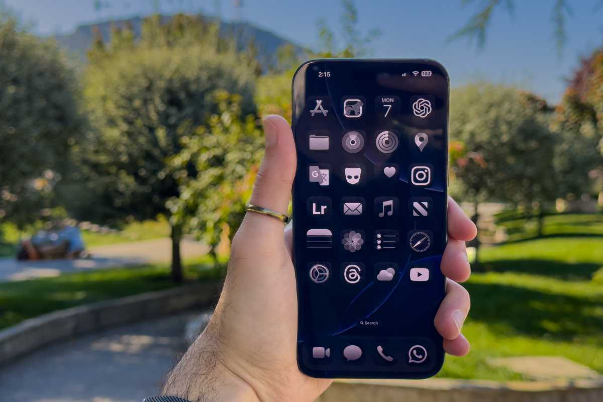
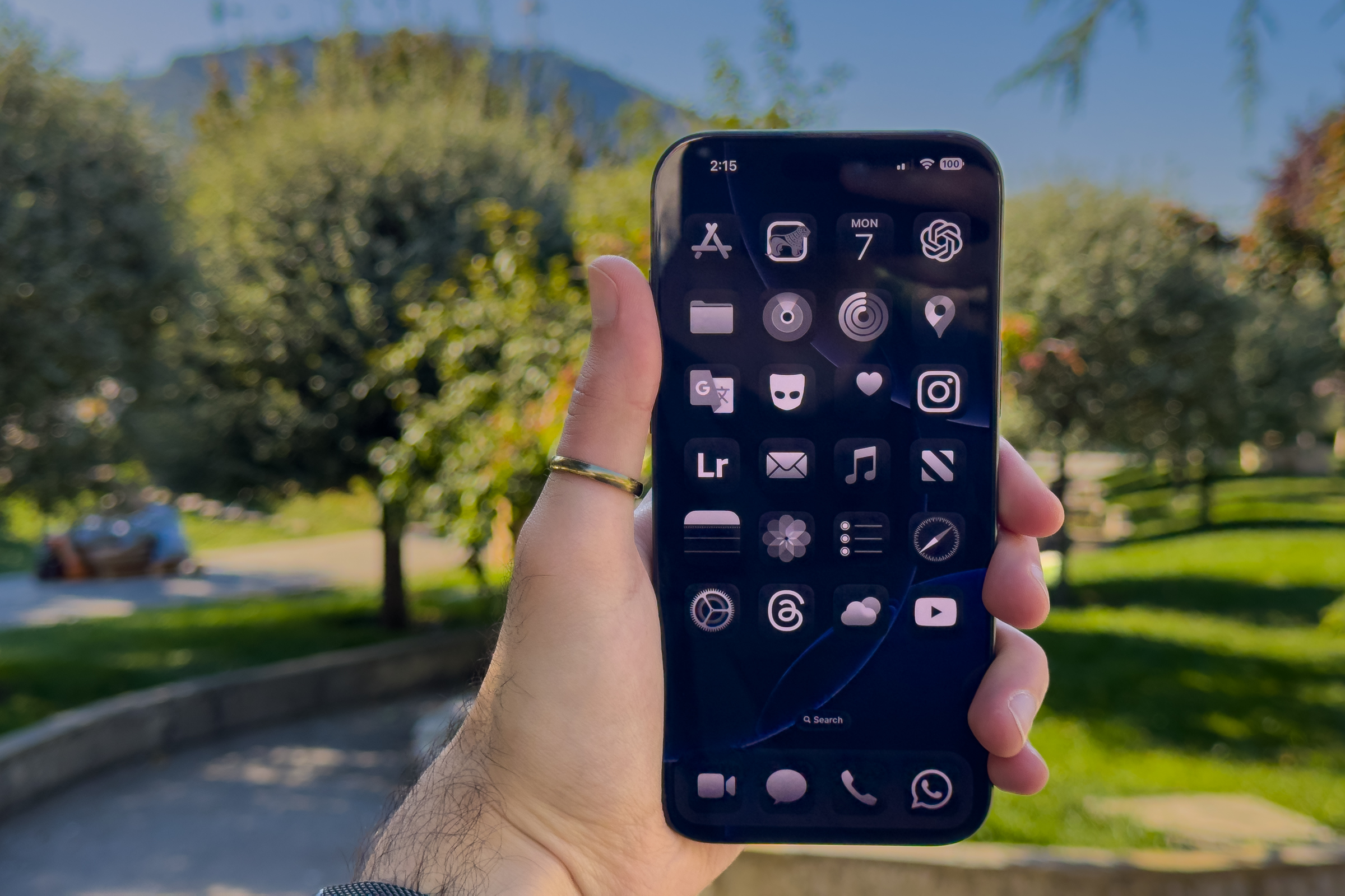
The iPhone 16 Pro Max has the biggest display ever on an iPhone.
Foundry
Add it all up
To be honest, I had very low hopes for the iPhone 16 Pro Max before buying it. While Apple offers an annual upgrade program that makes getting a new iPhone easy, iPhones are designed to last for many years, and most users don’t buy the latest model annually. As such, it’s irrational to demand groundbreaking changes and major introductions every single year. Those upgrading once every three generations or so will notice a ton of difference.
Nevertheless, I was utterly surprised by how meaningful the jump from an iPhone 15 Pro Max to a 16 Pro Max has been. It now looks sleeker, lasts me longer on a single charge, remains relatively cool, and doesn’t blind me before sleep. More importantly, though, Photographic Styles 2.0 enhances my shots on the go, and the irritating lens flare has seemingly been minimized. From afar, these may all appear like insignificant adjustments. In reality, however, they address numerous iPhone imperfections, add features that we truly need, and make the 16 Pro Max the most polished iteration yet.


