Roku is shaking up its home screen with its most substantial changes in over a decade.
A new design debuting this week adds recommendation rows, quick action tiles, and genre subsections to what was once a simple grid of apps. In some ways it’s an overdue change that helps users make sense of all their streaming options (while also helping Roku make more money), but it’s also likely to polarize some users who’ve grown accustomed to Roku’s stripped-down menu system.
You might not see the changes right away, as they’re rolling out in waves over the coming months. But you might as well prepare yourself, as there’s no going back to the old Roku home screen once the new version arrives. Here’s how you can make it work for you:
Tune the recommendations (or turn them off)
Jared Newman / Foundry
The top of Roku’s new home screen now includes a cluster of “Top Picks for You” suggestions for what to watch. These are supposed to improve automatically over time, but you can speed things along by highlighting a recommendation, hitting the * button on your remote and selecting “I like this show” or ‘I don’t like this show.”
To disable these recommendations entirely, head to Settings > Home Screen > Recommendation Rows, then select “Hide.”
Customize the Quick Access panel (or get rid of it)
Jared Newman / Foundry
Just below those top recommendations, you’ll see a Quick Access section with app icons and links to various submenus. These tiles will change over time as Roku tries to predict the most useful options for you.
To make this menu more predictable, try pinning some of your favorite apps. Scroll all the way down to the Your Apps section, highlight an app, then hit your remote’s * button and select “Add to Quick Access.”
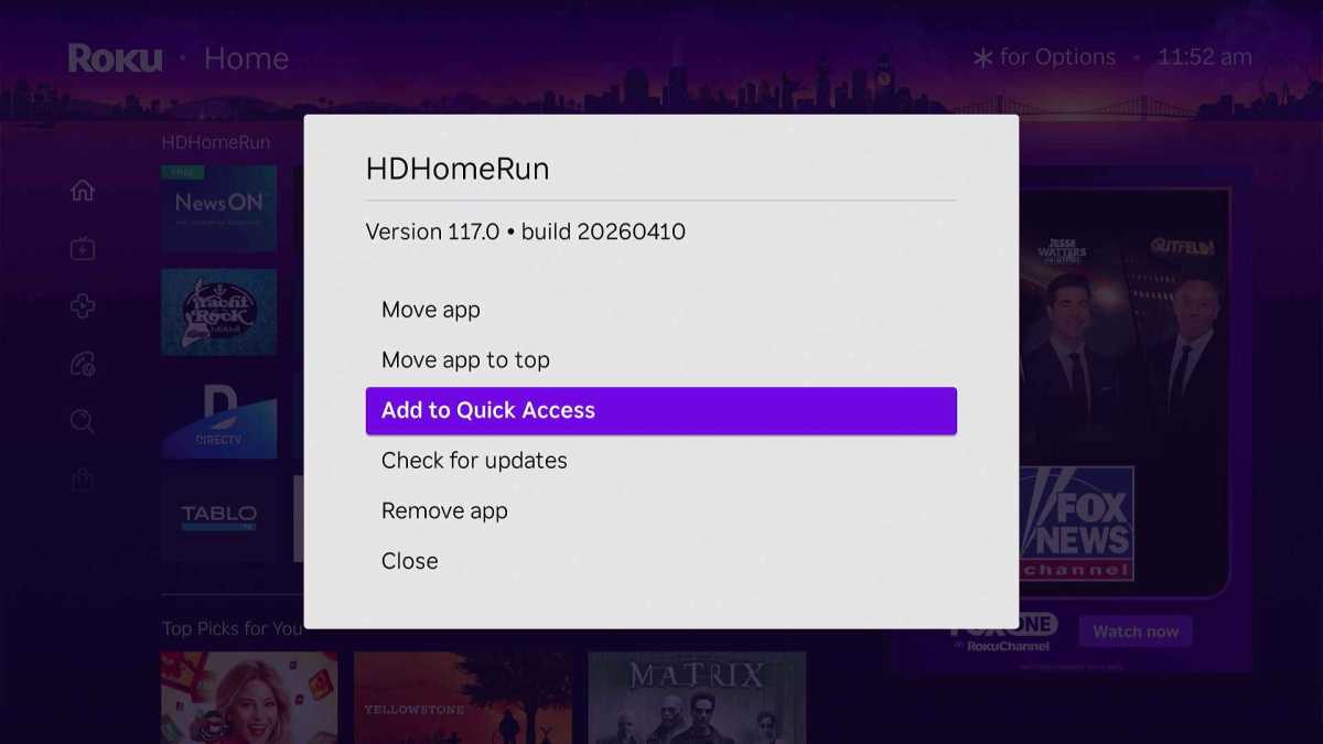
Jared Newman / Foundry
You can also pin your favorite menu shortcuts to this section as well. This can be helpful, for instance, if you want faster access to Roku’s “Continue Watching” menu (which resumes the movies and shows you’ve already started) or specific genres such as Sports and Comedy.
But if you’d rather hide this new section, that’s also doable. Just head to Settings > Home Screen > Quick Access, then select “Hide.”
Resize the Roku home screen icons
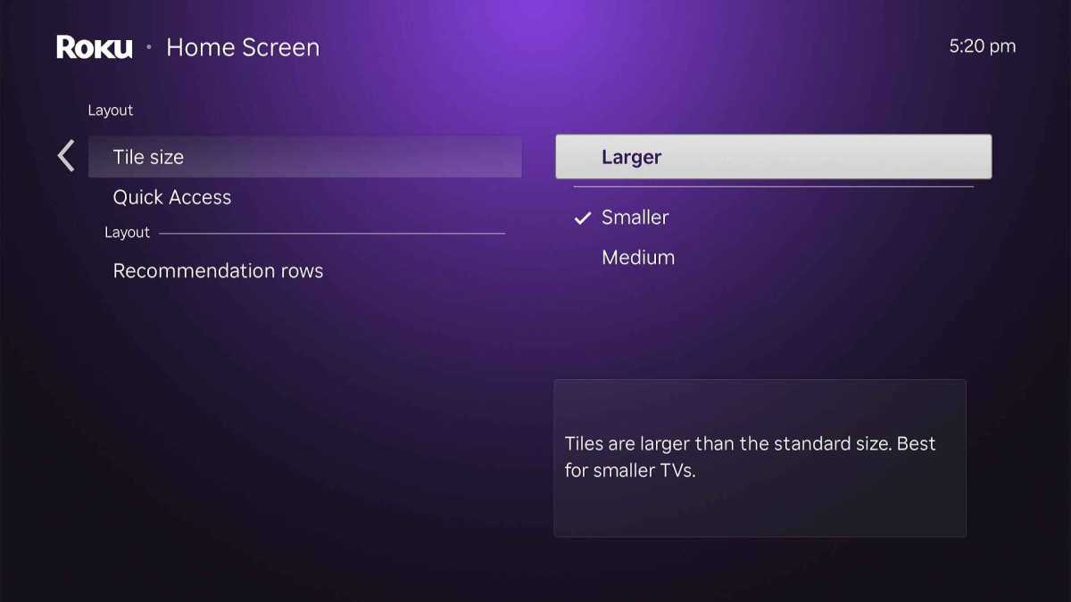
Jared Newman / Foundry
Roku’s new home screen uses much smaller app and content icons by default, cramming five of them into each row. To make Roku’s icons bigger again, head to Settings > Home Screen > Tile Size, then select Medium (for four apps per row) or Large (for three apps per row).
Link your subscriptions
Jared Newman / Foundry
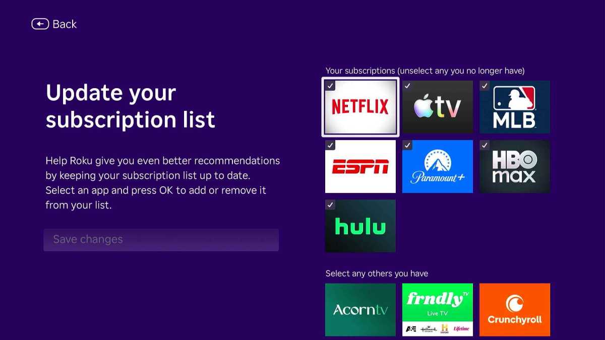
In Roku’s left sidebar, you’ll find a genuinely useful “Subscriptions” menu, which suggests movies and shows to watch from the streaming services you’re already paying for. While Roku tries to recognize your subscriptions automatically—for instance, when you sign into an app and start using it—this doesn’t always work if you’ve recently cancelled a service or are just setting up a new device.
To manually adjust what appears in the Subscriptions menu, scroll down to the “Your Subscriptions” heading, then scroll over to the “Update List” button. Select the subscriptions you have, then hit “Save changes.”
Use the “For You” menu
Jared Newman / Foundry
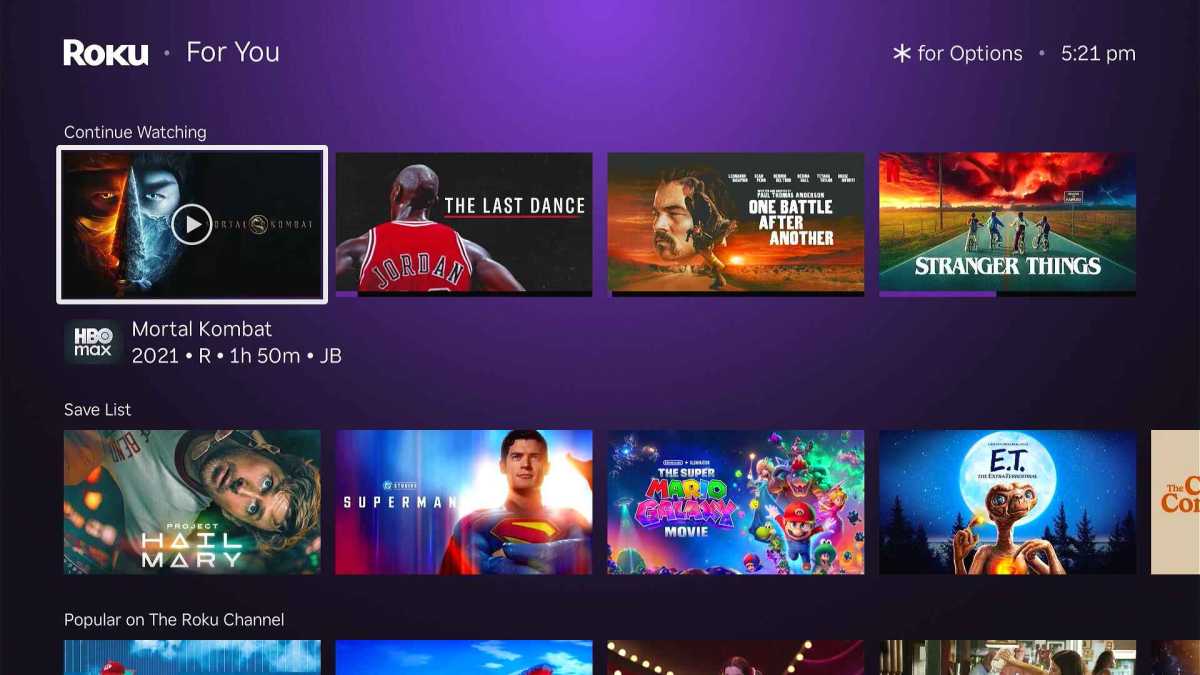
The menu formerly known as “What to Watch” is now called “For You,” and you can find it through the left sidebar or the main home screen. Notably, this is where you’ll find the “Continue Watching” section for picking up where you left off on shows and the “Save List” of programs you’ve bookmarked for later.
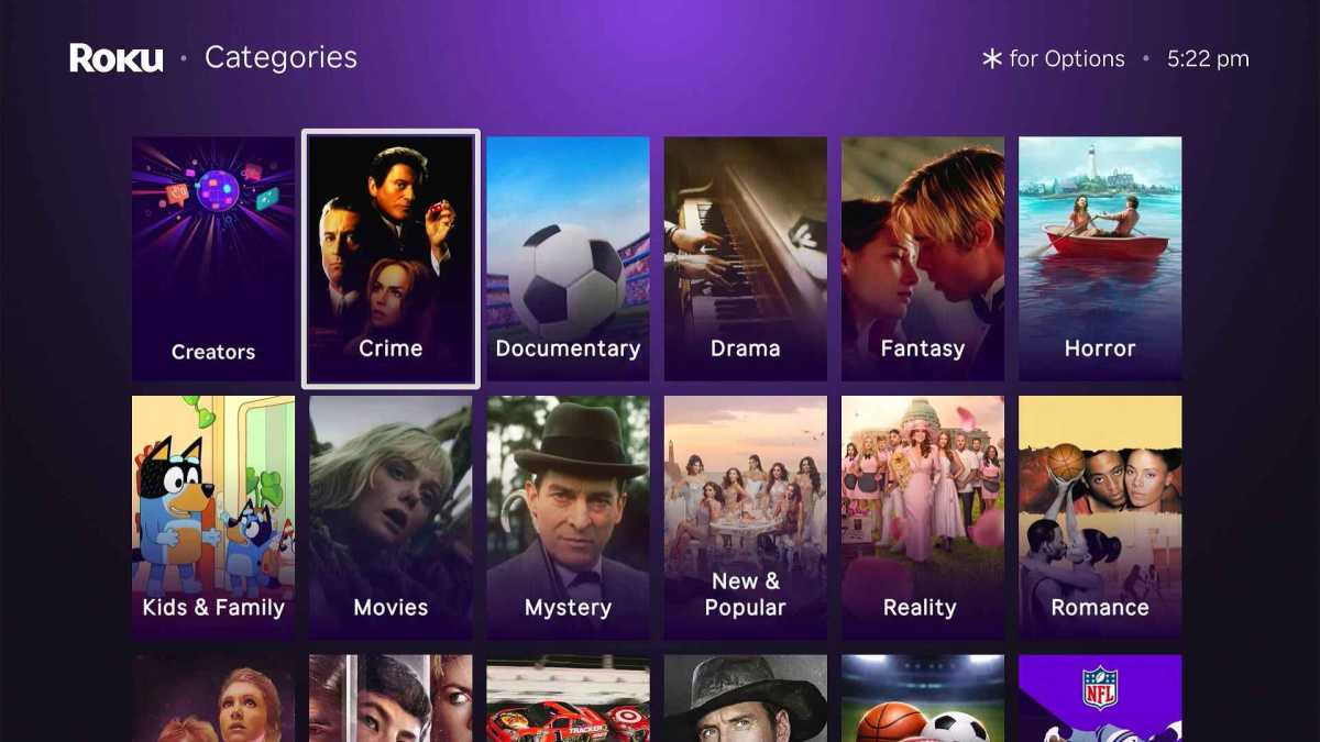
Peruse the full Categories list
Jared Newman / Foundry
Further down the home screen, you’ll find a list of genres under the “What Are You in the Mood For?” heading. Clicking the “More” button will take you to the full list. If you’re wondering where the “Featured Free” and “Daily Trivia” sidebar menus went, you’ll find them here instead.
Note that you can pin any of these genres to the Quick Access menu as well.
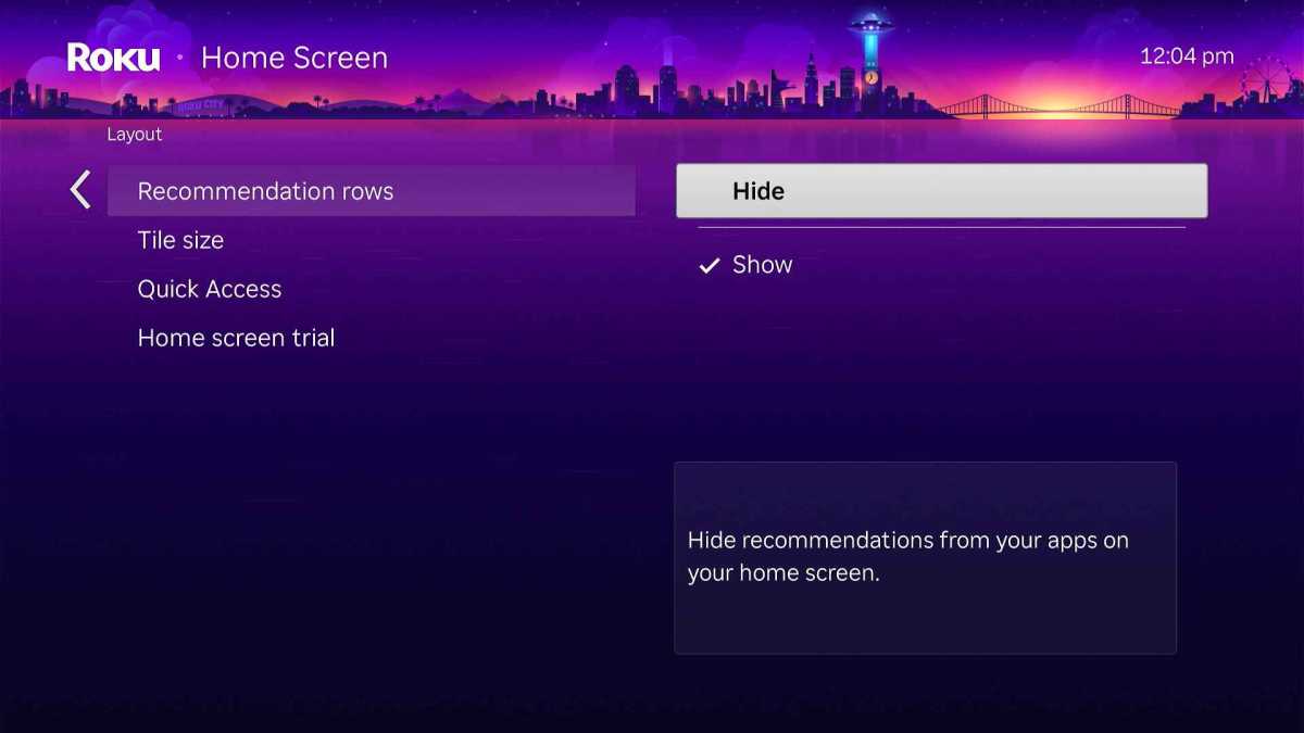
Bring back the old Roku home screen (sort of)
Jared Newman / Foundry
While Roku doesn’t let you fully opt out of the new home screen, you can undo most of the changes with a few settings tweaks:
- Head to Settings > Home Screen.
- Under Recommendation Rows, select “Hide.”
- Under “Quick Access,” select “Hide.”
- Under Tile Size, select “Medium” or “Large.”
Some small differences will remain. You can no longer customize the left sidebar, and you can’t hide the “Best Across Your Streaming Services” or “Jump To” rows beneath your app list. But if you just want Roku’s app menu to be as simple as possible, these tweaks will mostly get it done.
My take on the new home screen
While I can do without the new Recommendation Rows and will be disabling them on my Roku players, I appreciate having quicker access to things like the Subscriptions menu and the Continue Watching row. (It’d be better, though, if the latter was embedded directly into the home screen itself.)
My main gripe is that you can’t manually re-order items in the Quick Access panel, nor can you demote Netflix from the top position without removing it entirely. Having icons that constantly shift around is a recipe for confusion, and is a reminder that while Roku still offers some control over the new home screen, its business interests might occasionally get in the way.
Sign up for Jared’s Cord Cutter Weekly newsletter for more streaming TV advice.


